MatchPoint Associates
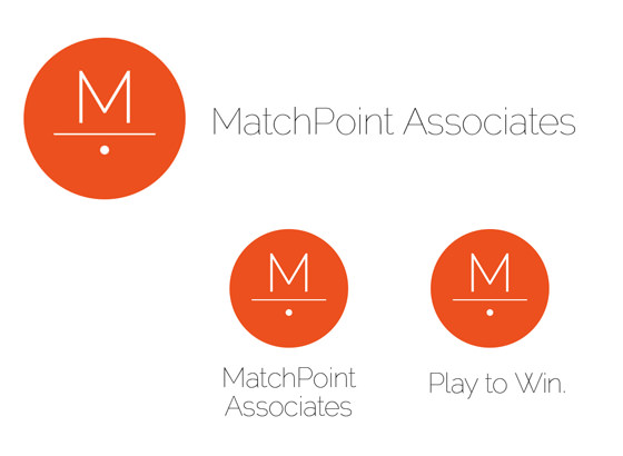
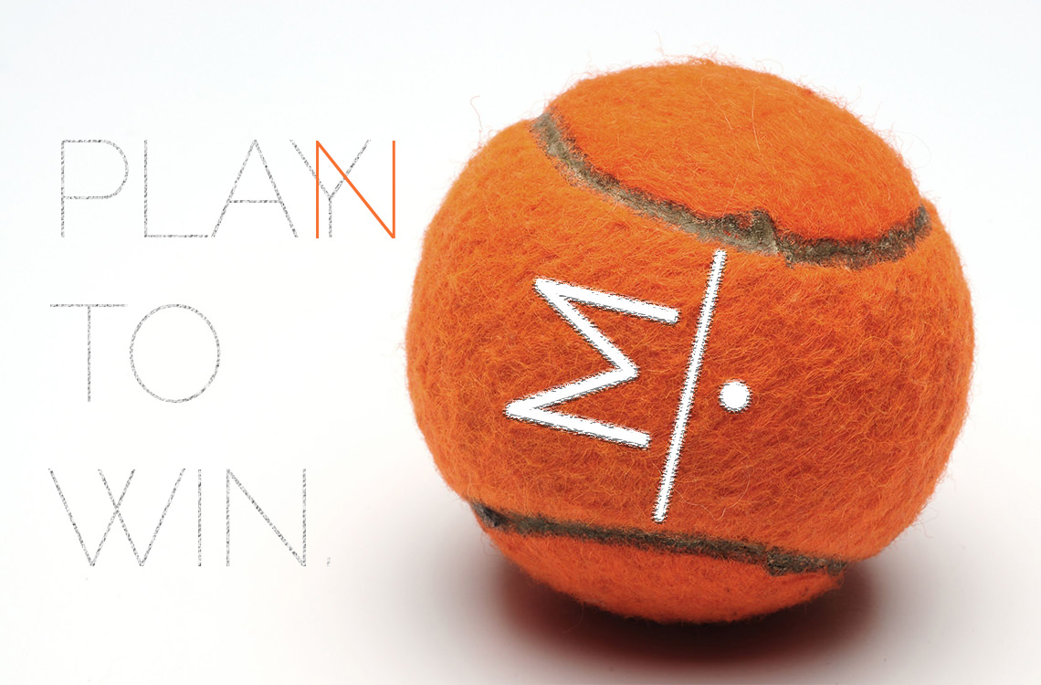
MatchPoint Associates was founded as a one-man operation, but he needed his brand to represent a well-established company. The founder’s love of tennis is how he derived the name MatchPoint, wanting to incorporate this aspect into his brand. The idea of making tennis a metaphor for business consulting was a pretty sound idea for his brand & would differentiate MatchPoint among its competitors. We created the logo by playing with numerous variations of tennis-related imagery to represent the sport as a whole, before landing on the beautiful icon that is MatchPoint Associates today. The logo was built to represent tennis without being overt or tacky, while striking a chord with the idea of balance in business. In addition, we wanted to capture the “on point” feel. We also designed & produced custom, branded orange tennis balls made to give to their prospective clients, which proved to be successful in increasing brand salience with their core leads/prospects.
ARTIST
Hillery Kemp & Daniel Stephens
What we did
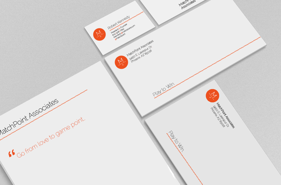
Brand Identity / Graphic Design / Collateral / Branded Merchandise