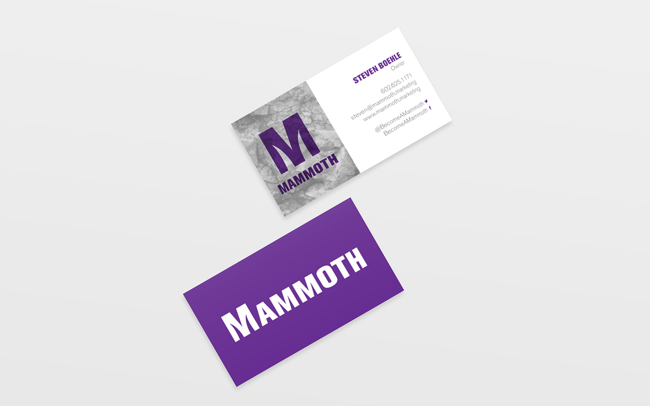
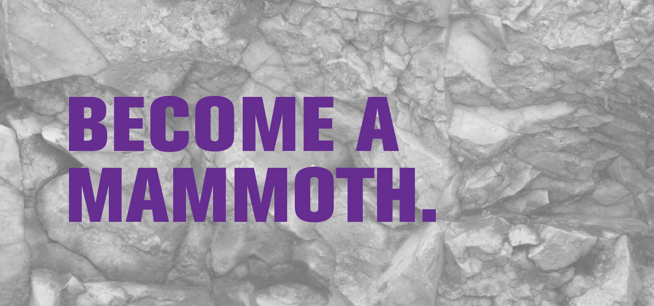
MAMMOTH MARKETING
Mammoth Marketing came to Darkly wanting to revitalize their current logo with a clean and simple look. We chose to use a bold typeface to emphasize what it is to be a mammoth and the negative space in the ‘M’ was the perfect opportunity to do something unique. This way, the ‘M’ can stand on it’s own as a icon as well as with the entire wordmark.
ARTIST
Alexis Peschke
What we did
Brand Identity / Graphic Design